Think about all the products that you purchased because of the compelling tagline, or just because that product is endorsed by your favorite star. This is how a good advertisement influence consumer.
A great advertisement is about how it drives and convinces customers to purchase the product. Advertisement is basically a strategy that a company uses to tell the world that I have a product, this is how it works & why you should only buy it. From recent times advertisements have become more creative, minimalist & subtle, setting the expectation bar too high!
Professionals involved in this domain are the main mastermind behind all the marketing campaigns. They are the ones who are responsible for bridging the gap between products/services & consumers.
In this blog, we have put together a few points that you should keep in mind while designing the next ad campaign.
Important Designing Rules to Learn to be Good in Advertising Designing
Have a look at these awesome techniques to be the next advertising designer.
1. Keep things simple
It is one of the greatest misconceptions that advertisement means putting each & every element into it. Advertisements do not exactly mean extravagant pictures you can definitely take the other route and go for the simpler options. Presenting & capturing simpler things will allow you to reach more people and besides that, it will also give more focus to your products.

2. Use visual metaphors
Visual metaphors play an important role in the game of advertisement. This technique can be a bit tough to apply but it is always worth it. Try to work on the ad until the metaphor employed seems obvious enough to understand.
Let’s take an example of this advertisement by Mitsubishi Motors. The rhino in the a is used to highlight the features of the car, it shows strength, stability, wildness & toughness. They have used rhino because it is one of the strongest animals that have excellent instinct to survive in wild conditions.

3. Use scale purposefully
Focusing on the main segment is the crucial element of good design. Just like any other designs, advertisements also work by the fundamental rules. Many advertising companies pay major attention to the scaling technique.
Check this advertisement from Staedtler. The pencil has been scaled quite a bit to ensure that the focus goes directly onto the lead of the pencil that has been carved into various buildings. This not only invites many readers but also reinforces the message that goes directly into the reader’s mind. So, employing scale can actually give you a stunning image with a powerful message.

4. Make advertisements interactive
When ads are basically designed for people then why not bring them into that? There are basically two types of advertisement, one which you can simply look and the other in which you interact. The latter is the more favored one as consumers actually get involved with the product. Interactive ads stay longer in the mind of the consumer than the normal one.
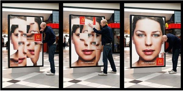
Food company McDonald’s used their billboards as a puzzle and ask it, customers, to solve the puzzle in the shortest time period to get a free meal.

5. Negative space
Negative space is boon to the design process. The negative process is basically a space around and between the focused object. Negative space looks a bit tricky to beginners but can become a clever option to create a visually stunning design. This is considered as one of the most overlooked principles of design but it actually gives the eye a place to rest in the design, increasing the appeal of the design in a subtle way.
See how stunning the zoo logo looks!

6. Make them stare
Companies use something distracting that makes the customer look a second time at advertisement to fully understand it. Hidden in plain sight has become a new trend in the advertisements. With such ads, customers try to focus on the concept which the organization wants to communicate.
Colgate smartly used this method to show how dirty teeth can become a distraction. So, whenever you create ad next time make sure to keep this point in mind.

7. Repetitions and patterns
Repetition is one of the most powerful tools that can be used in the world of this dynamic design. Patterns turn out to be a great aesthetic element. You can consider repeating and creating a pattern & using it in some way which can be used in some powerful manner.
You can take the example of the image below. In the image, buildings are used as a repetitive element. Repetition causes an odd image to stand out more brightly.


With ever-changing trends the list is going to be endless! The rules will never end and there will definitely be more tips to understand good design. While trying these things you can explore other areas also that will surely add effectiveness in your work
Look at your brand and product for which you are creating the advertisement and try to think of an extremely new perspective even if it is illogical. With the design, you learn how to color outside the lines & not just inside it. Look for other ways to the same problem and who knows you end up creating something iconic!
If you are planning to be pro in the advertising field then, we have an amazing Advertising Design Course in Delhi for you. This will be taught to you by industry expert professionals.
Have fun and keep creating new things!
Similar Blogs:


Comments are closed.